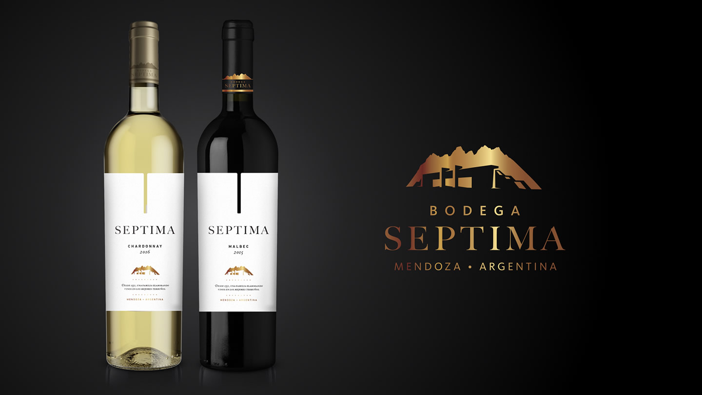
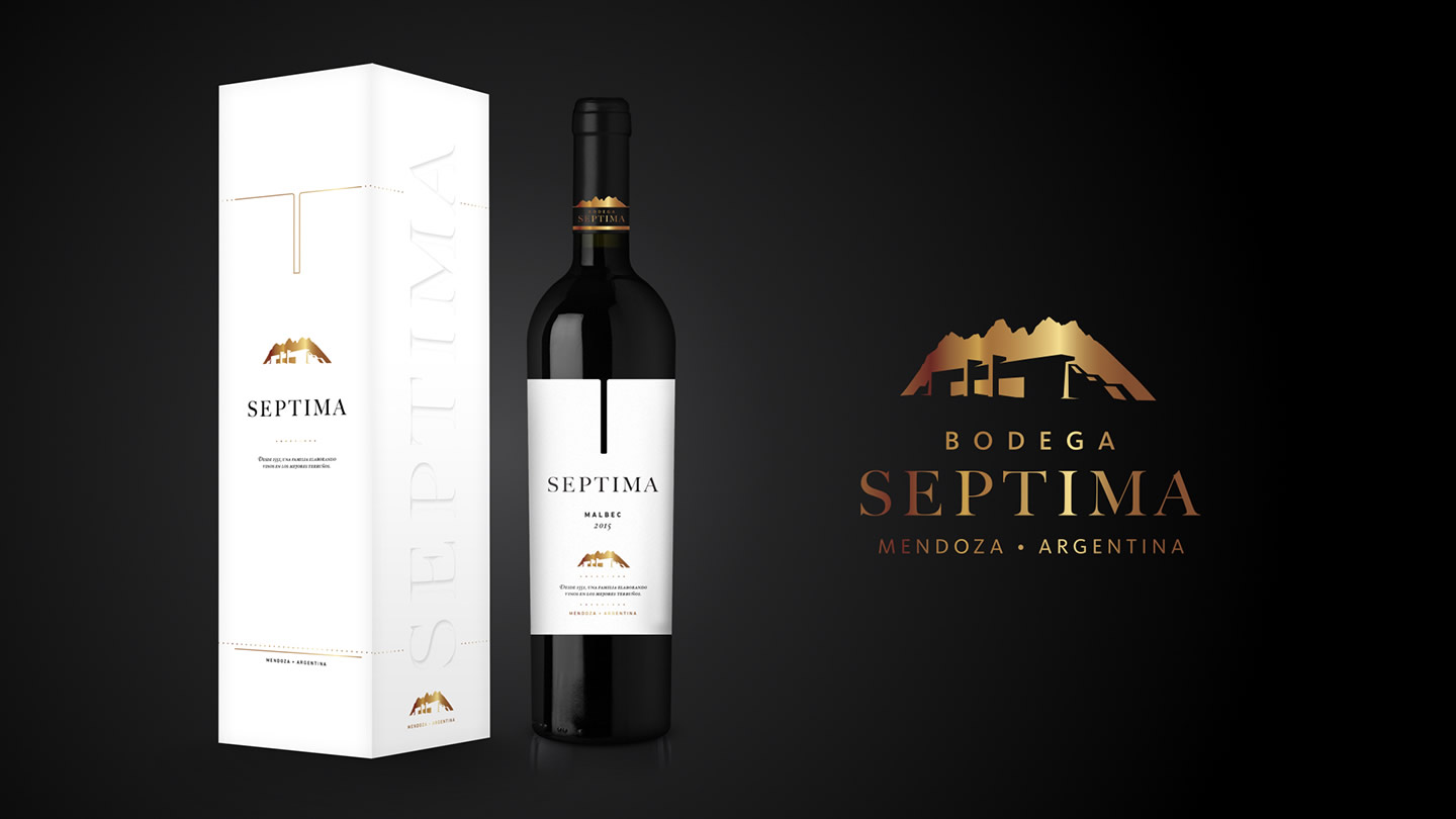
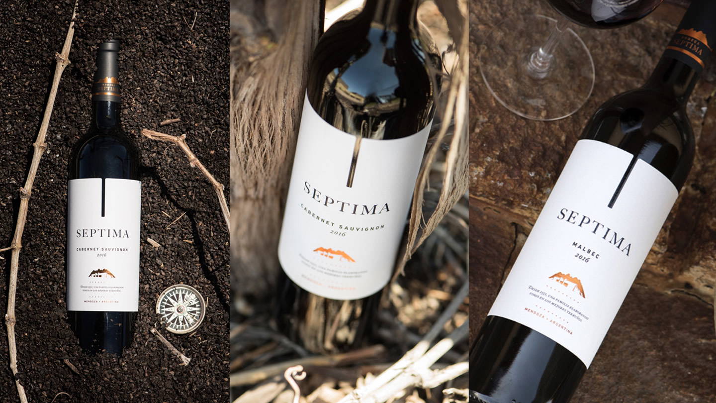
We designed the heart of Septima Winery
Revitalizing and take out a product from the comfort zone is not an easy task. Even when it is about the iconic wine of the winery, that represents the attributes and identity of it, capable of amalgamating its spirit and extend it to the others lines of the winery.
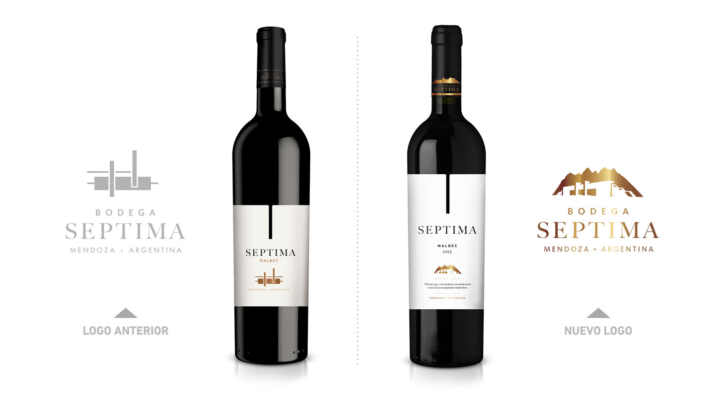
One of the main challenges was to work on the iconic symbol so that it stopped communicating in an abstract way and take it towards something figurative, warmer, that represents the tradition, the trajectory and the motto of «Passion and respect for earth» in which his spirit is based.
Regarding the label, we design it based on two main premises: on the one hand, leaving the comfort zone does not mean making radical changes but making the correct changes so that it achieves the new objectives, therefore, the trajectory was a value to maintain and it is reflected in the base structure of the label. On the other hand, to emphasize the main attributes of the winery, hence the change of color to a pure white, the incorporation of the legend of origin and the redesign of the symbol.


