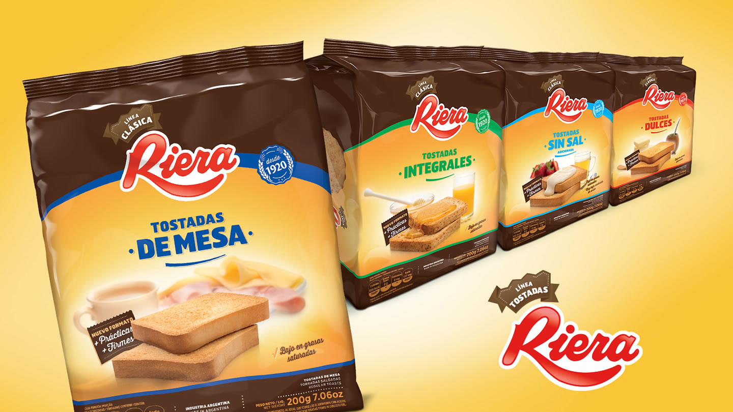
«The ones that mom would recommend»
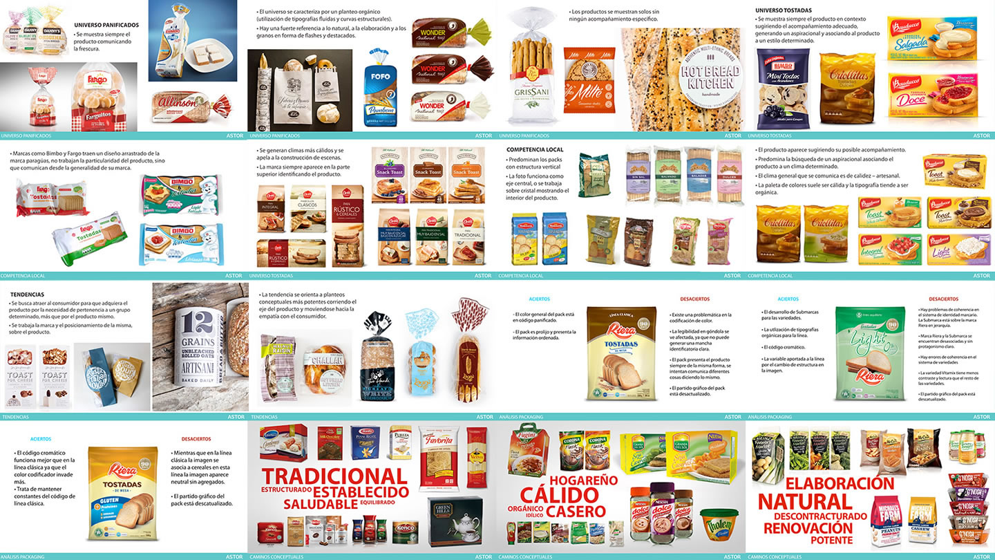
The main order consisted of refreshing the Tostadas Riera portfolio, renewing it, modernizing its structures and its graphic proposal to achieve modernity and impact in a trend market by capitalizing, on the positioning of the product, as a market leader, consolidating the values associated with the Riera brand.
The challenge was bringing the brand to the current moment and find a strong and clear way to address its 3 main audiences through a new current pack.
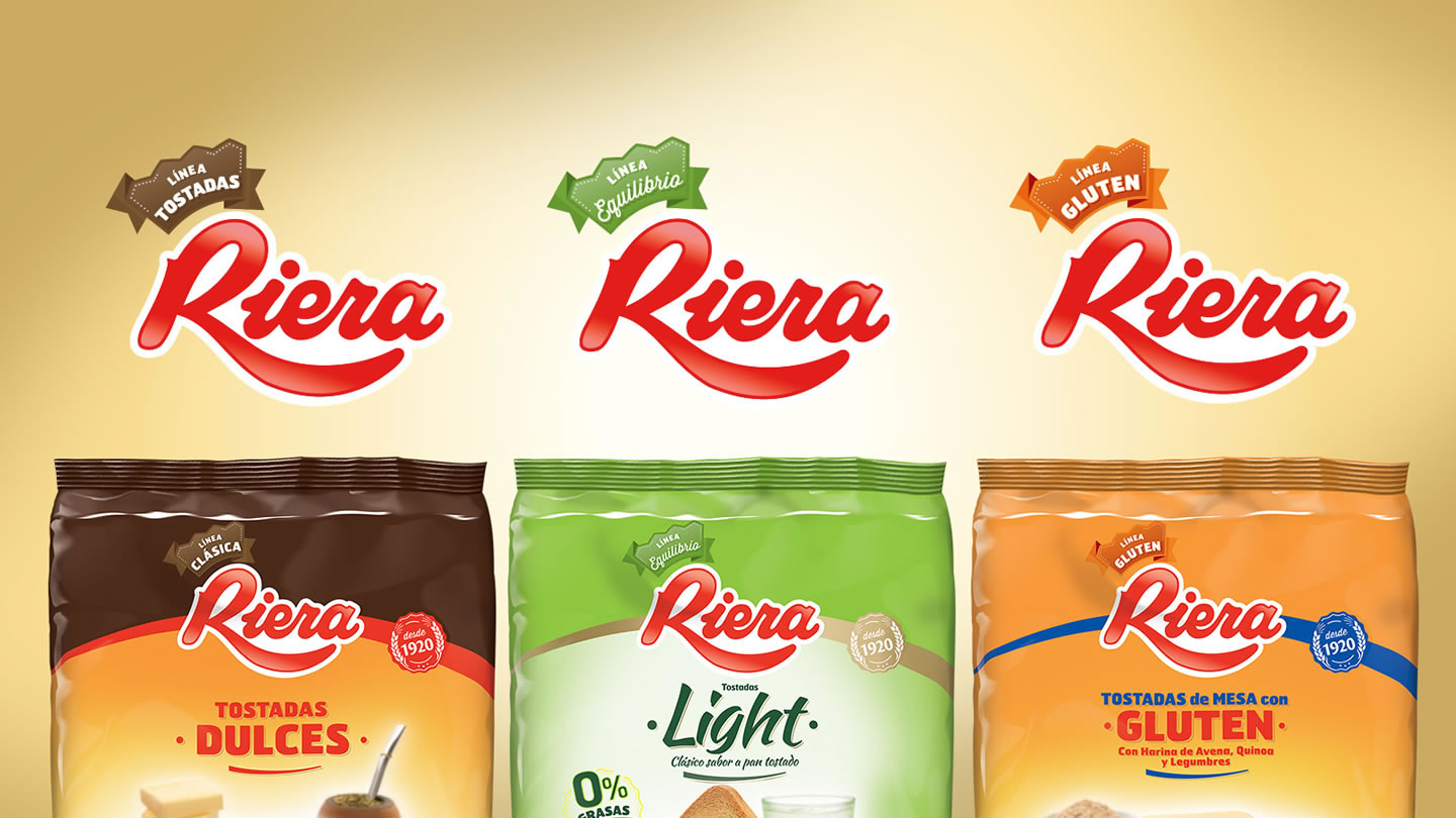
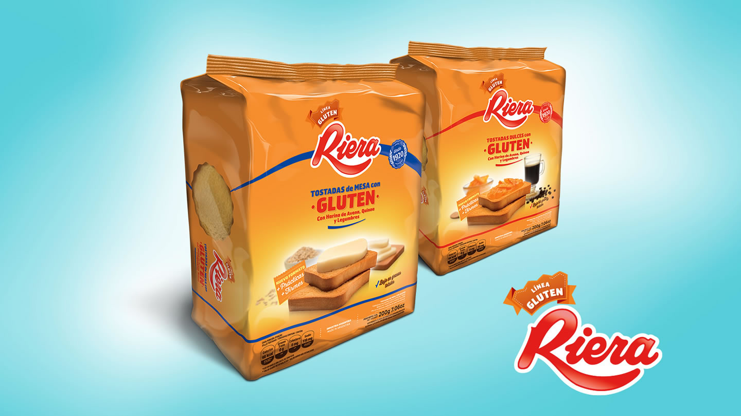
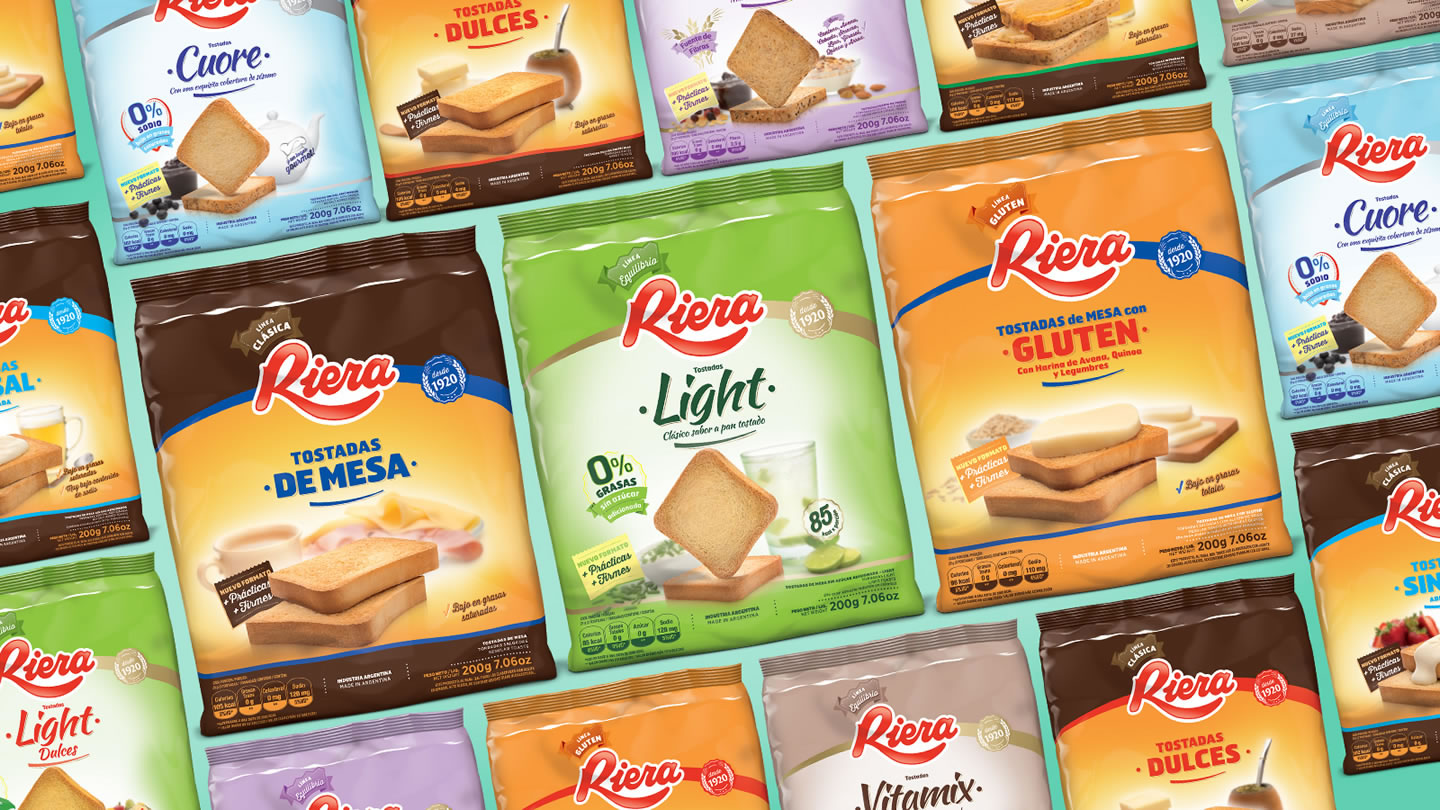
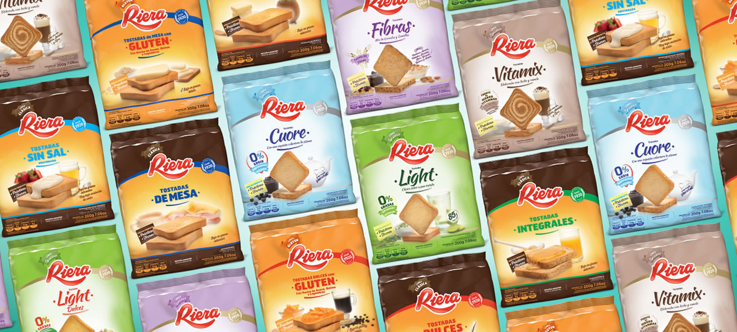
The first was focused on the housewife who always buys, who serves for breakfast and snack, the second: «Balance», focused on young people, sophisticated, with concern for the trend and healthy. And finally a «Gluten» line, focused on an more conservative older people.
The focus was placed on emotional contact with the client: close, warm, traditional, closer to the imaginary of the grandmother, but modern evoking memories and sensations. «The ones that mom would recommend».
The main goal was to combine the highlight of the brand historical benefits with a powerful, modern color graphic proposal, based on the trend and impact at first sight.
The use of graphic subsystems was key to enhance these benefits. Typographies, shapes and colors that define each line. In this way, achieved a faster, clearer and more accurate identification of the attributes of each product.